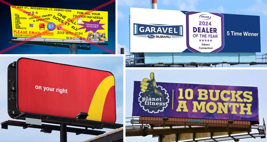
A billboard is like a giant Post-It note from the advertising gurus, trying to remind us of something important. But let’s face it, in the billboard battleground, simplicity reigns supreme, and here’s why:
1. Less is More (and More Memorable)
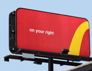
Three words. Speaks volumes.
Imagine you’re speed-walking past a jungle of billboards. There’s one whispering at you with text so tiny, you’d need the Hubble telescope to read it all. Then, there’s another. One big, bold message, impossible to miss. It’s like the billboard equivalent of shouting ‘Free Pizza!’ versus ‘A Complimentary Distribution of Circular Baked Culinary Products Of Italian Origin.’ Which one are you going to remember? Exactly.
2. Attention Spans of Goldfish
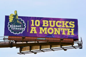
One of ours. Delivers the message like a sledgehammer.
We’re not proud of it, but our attention spans are about as long as a Snapchat streak. Studies consistently show that people remember simple messages better than complex ones. A simple billboard gets straight to the point—like a hilarious cat video in a sea of TikToks. It hooks you before your brain has time to switch to the next story.
3. The ‘Whodunnit’ Effect

My satirical creation combines many billboard sins.
Ever seen a billboard that’s like a crime scene with too many suspects? You spend so much time decoding it, you never really understand what they are trying to say. Simple billboards are like Scooby-Doo mysteries—easy to solve, leaving you time to ponder life’s real mysteries, like why cheese goes so well with everything.
4. Picture This: A Picasso or a Toddler’s Scribble?

Another one of ours. One clear message.
Would you rather stare at a Picasso or a toddler’s crayon masterpiece? Okay, bad example—they’re both intriguing in their own right. But a billboard should be more Picasso and less toddler—bold strokes, clear lines, and a story that doesn’t make you wonder if it was left there by aliens.
5. The Call to (Un)Action
Crowded billboards are like a high-pressure sales pitch from one of those TV infomercial companies. They throw so much at you, you forget what they’re selling. Simple billboards, on the other hand, gently nudge you like a friendly Labrador with a tennis ball—‘Hey, here’s the deal, let’s play!’
6. Clutter: Not Just for Closets
Let’s be real, life’s messy enough. We don’t need billboards adding to the chaos. Simple billboards are like the Marie Kondo of advertising—tidy, organized, and sparking joy… or at least a smirk:
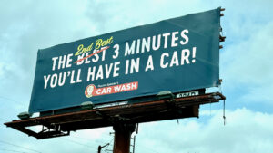
A witty billboard I spotted in the Hartford CT area.
Conclusion: Keep It Simple, Smarty Pants
In the epic saga of billboard battles, simplicity emerges victorious. It’s the witty one-liner at a cocktail party, the ‘aha’ moment in a world of ‘huh?’. When we are designing a billboard, the rule is: ‘keep it simple, keep it smart, and keep ‘em thinking about your business.’
BAM tells stories. Does your business have a story that should be told? Let us tell it… on billboards, on TV, everywhere! Let’s talk. Just fill out the form and we’ll reach out to have a conversation.
