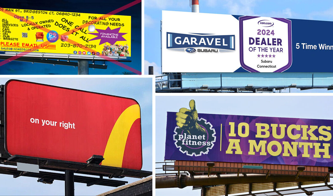
 A billboard is like a giant Post-It note from the advertising gurus, trying to remind us of something important. But let’s face it, in the billboard battleground, simplicity reigns supreme, and here’s why: 1. Less is More (and More Memorable) Imagine you’re...
 Consistency: The Non-Negotiable in Branding by Jeanne Rolston, Senior Art Director Let’s talk about consistency. If your brand’s identity isn’t as steadfast as your grandma’s secret cookie recipe, you’re doing it wrong. Every email,...
 Presented by Google, Bob Abbate Marketing and the Bridgeport Regional Business Council. EVENT: B2B SALES IN THE AGE OF ASSISTANCE DATE: November 14, 2018 11:45 am – 1:00 pm LOCATION: BRBC Conference Room 10 Middle St., 14th Floor Bridgeport, CT As we enter into...
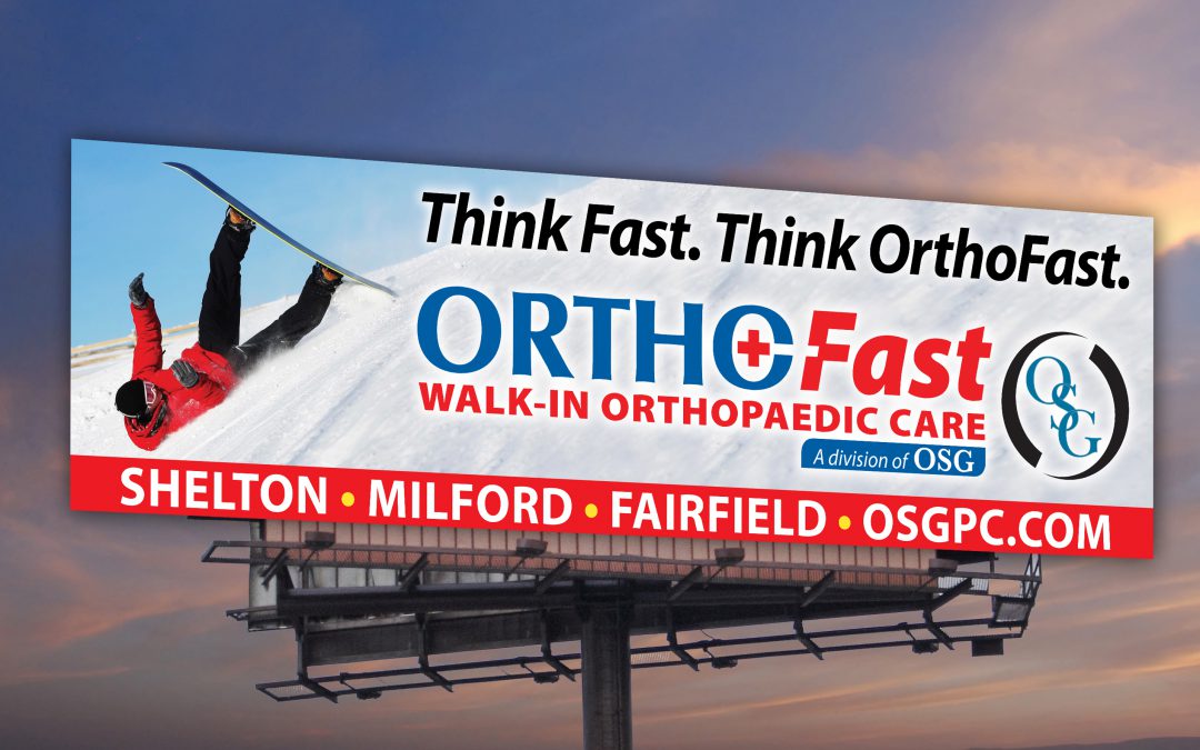
 Want to get your message out there in a BIG way? Digital billboards are here to stay, and they’re a BAM specialty. Our BIG creative designs are on display in cities and towns around the country. One of the advantages of digital billboards is immediacy. As soon as a...
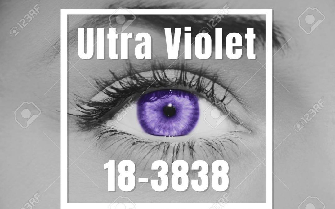
 This year it’s Pantone 18-3838, also known as Ultra Violet. Heres why it matters: Colors can be synonymous for the brands they represent, like Tiffany Blue, or Coca-Cola Red. This is important because having a color palette a company can identify with helps...
